Chapter 8: The WHO: Jewel of the sixties
On 24 May 1962, Sergei Kurashov, the Russian president of the World Health Assembly of the World Health Organization (WHO), announced the program for the building site he was inaugurating: “The building to be constructed here shall stand as a symbol and focal point for the hope of all humanity to some day be free from disease” (1). His words encapsulated the lofty ambitions tied to the project. These included scientific ambitions, bolstered by the promise of therapeutic and preventive medicine; the political ambitions of the UN system, which had taken on the manifold challenges of decolonization; and, last, architectural ambitions.
The WHO’s global headquarters sought to reflect its definition of health as “a state of complete physical, mental and social well-being” through a spacious, ideally situated building, offering comfort for its occupants, aesthetic enjoyment, and an appearance of balance and monumentality. The plea, 20 years earlier, from a trio of artists and architects — Siegfried Giedion, Fernand Léger, and José Louis Sert — had been heard: “The people want the buildings that represent their social and community life to give more than functional fulfillment. They want their aspiration for monumentality, joy, pride, and excitement to be satisfied” (2).
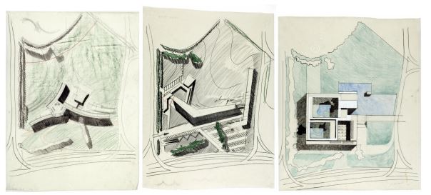
Sketches by Jean Tschumi for research on the shape and positioning of the future building on the plot
© Archives de la construction moderne – Ecole polytechnique fédérale de Lausanne; fonds Jean Tschumi
The WHO directors' ambitions were as great as their struggle to find a suitable space. The organization was then occupying cramped quarters in the Palace of Nations. From 1948 to 1958, its membership had expanded from 35 to 90 states, while staff had grown from 150 to 600. Various options for extending the Palace were considered, but the 100-metre tower proposed by Jacques Carlu, the architect of the Palais Chaillot in Paris, caused an outcry in Geneva. Never again would the UN or the Swiss authorities dare suggest that building higher could help solve the shortcomings of the Ariana site.
The WHO wanted a place of its own. It finally acquired one with the help of the Swiss government, which was committed to supporting the rapid development of international institutions in Switzerland. Encouraged by Bern’s offer of a 20-year, interest-free loan of 20 million francs, the canton of Geneva gave the WHO a plot in Pregny, on a hill overlooking the Palace, and a second loan of 10 million francs on the same terms. In 1964, the federal and cantonal authorities provided another 10 million to cover mounting construction costs, which the initial budget had grossly underestimated (3).
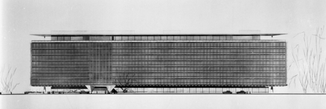
Profile of Jean Tschumi's project
© WHO
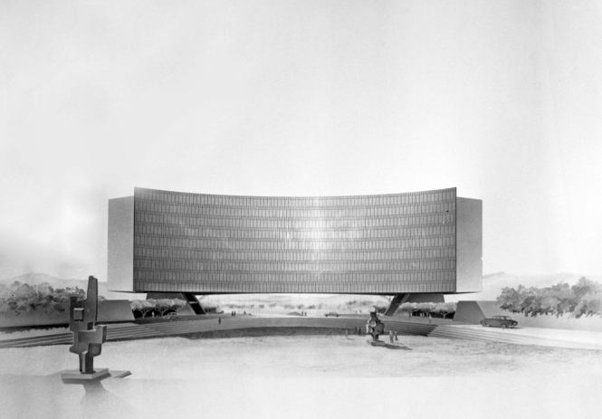
Profile of Eero Saarinen's project
© WHO
In 1960, Jean Tschumi was declared the winner of an architectural competition organized by the WHO board. The Swiss architect, celebrated for his award-winning Nestlé headquarters in Vevey, had faced serious competition. The American Eero Saarinen, one of 15 famous architects invited to participate, wowed the jury with a stunningly elegant curved building that seemed to hover above the ground. But he won second prize: the overall quality of Tschumi’s project proved hard to beat.
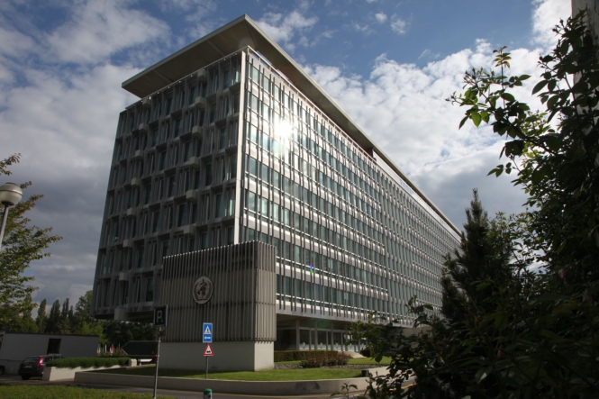
A massive effect gives place to volume
© Jess Hoffman/WHO
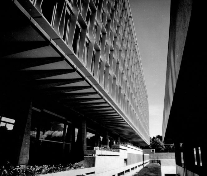
The reinforced concrete structure and its diagonal beams
© Jean-Philippe Charbonnier / WHO
The former director of the School of Architecture and Urban Planning at the Federal Institute of Technology in Lausanne, Tschumi was famed for his attention to detail. Thus, his plans for the WHO included a wealth of exterior and interior details, showing that his main concern was to create a practical, cost-effective, and functional building. He was the first architect of Geneva’s international quarter to make unlimited use of the technical and aesthetic possibilities offered by modernism, and to do soon a large scale, in a building 152 metres long by 35 metres high. He compensated for the structure’s massive size by using concrete and metal to create volume effects, and enhanced its plasticity through two devices: a reinforced concrete structure, supported by diagonal beams ascending on either side of two rows of slightly twisted, pyramidal pillars; and a flat roof, which seems to hover above the building like a parasol.
On this isolated plot, in an idyllic setting, the architect established a relationship with the landscape that could only be described as sublime. The eight-story block faces northwest and southeast due to “the fall line of the terrain and the general direction of the lines of trees”, Tschumi explained (4). The upper floors boast spectacular views of the lake and Alps. Offices are distributed along the façades according to a 180-centimetre grid, whose regularity creates a rhythmic pattern along the exterior. The modular offices can be refitted to meet changing needs.

The interior arrangements proper to the administrative architecture
© WHO
At the time that Tschumi was working on his blueprint, administrative architecture was divided over the recurring question of how best to organize work in offices. Americans generally opted for open-plan offices on an entire floor, exemplified by Mies van der Rohe; whereas Europeans, following Le Corbusier, still favoured individual offices along the outer walls, of varying size depending on the occupant’s rank, with the one-window cell as the basic unit. Today, parts of the upper floors of the WHO building are laid out as open-plan offices, and their users are reportedly happy, yet the cellular office still predominates in the administrative culture of Geneva’s international organizations.
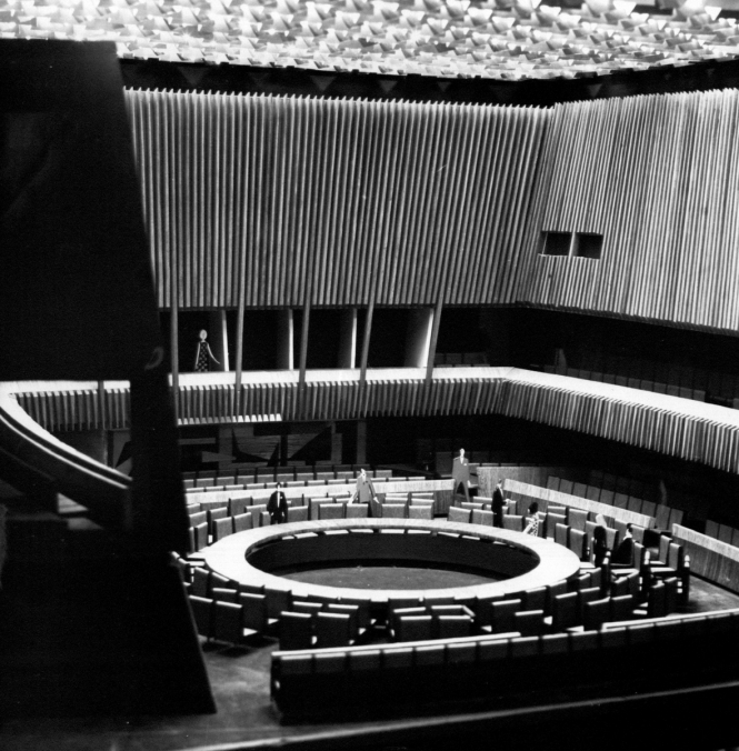
Inside the council room
© WHO
The council room was a central element of the project, due to the need for another large conference hall in the Palace to be available at all times. Tschumi underscored the room’s importance by enclosing it in a separate single-story, windowless cube of white marble at the foot of the main building. A spiral-shaped gallery on stilts connects the two contrasting structures. A fountain and patio gardens enliven the spaces below the façade’s overhang, enveloped in a cladding of aluminium lattice.

Jean Tschumi, laureat of the International Reynolds Prize, and the awarded model of Nestlé headquarters in Vevey
© Pierre Izard / Archives de la construction moderne – Ecole polytechnique fédérale de Lausanne; fonds Jean Tschumi
Tschumi’s second talent lay in covering buildings in new materials used purely for decorative purposes. He pioneered the use of aluminium in Switzerland, especially in cladding. In 1960, he won the International Reynolds Prize* for his Nestlé headquarters. The jury, chaired by Walter Gropius, praised him for his “sensitive use of aluminium, which has been little explored until now” and “highly delicate and tasteful [use] of vertical panels and sun visors to break the monotony of the windows without obstructing the view from inside”. Tschumi, the prestigious jury declared, used aluminium not merely for effect but also to attain “a quality of simplicity and serenity that enhances the architectural concept” (5).
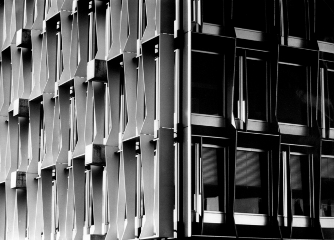
The sun visors, as if it was lace
© WHO
Tschumi’s design for the WHO carried this quality to the extreme, with cast aluminium sun visors framing the windows and enveloping the glass façade in what resembles an embroidered veil. Engineers praised the technical performance and originality of his curtain-walls compared to the general practice of the time. His curtain-walls also embody one of the central tenets of modernism: decoration should consist of architectural elements rather than pure ornamentation.
In the early years of his career in Paris, Tschumi had befriended Emile-Jacques Ruhlmann, one of the champions of art deco. Before establishing his practice in the French capital in 1934, Tschumi worked as an art director, creating the decorative designs for a weapons factory and collaborating on the interiors of first-class cabins for the ocean liner Le Normandie. In 1937, he won a prize for his plan to organize underground traffic in Paris, a milestone in his career as an architect and urban planner. These early experiences informed his drawings for the interior and exterior of the WHO “ship”, which were especially well executed from both an aesthetic and a technical point of view. His choice of cladding materials, colours, lighting, finishes, and even furniture gave the building a symbolic dignity, as the WHO had hoped for.
Today, the WHO headquarters’ beauty and structural longevity place it among the masterpieces of contemporary Swiss architecture. Yet it also reminds us of its creator’s tragic end: Jean Tschumi died suddenly in January 1962, while returning from Geneva to Paris by train, before the first stone was laid. That the building was completed faithfully and without incident by his good friend, Pierre Bonnard, attests to the excellence of his design and the esteem in which he was held among his peers — such that a disinterested heir, able to execute his plan, was found immediately.
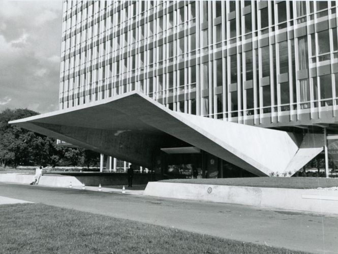
The cantilever canopy of WHO's entrance
© Archives de la construction moderne – Ecole polytechnique fédérale de Lausanne; fonds Jean Tschumi
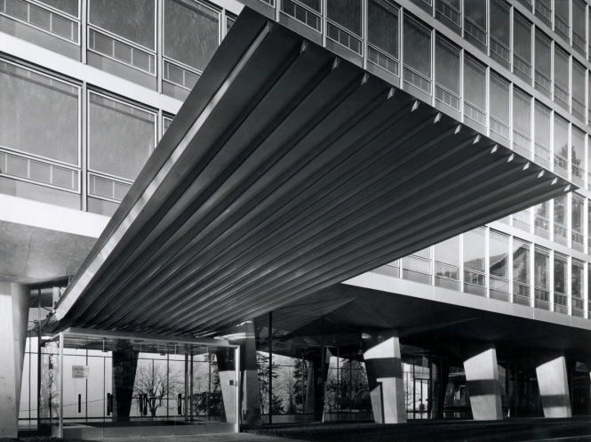
The entrance canopy of Nestlé headquarters in Vevey
© Eric Ed. Guignard; Vevey / Archives de la construction moderne – Ecole polytechnique fédérale de Lausanne; fonds Jean Tschumi
The building was inaugurated in 1966 to thunderous acclaim from architects and connoisseurs. The result met Mies van der Rohe’s definition of success: “When a true construction meets a true substance, it results in a true work of art which is faithful to the essence of both”.
For many years, the Genevans simply ignored this tall building on the periphery of the life of their city, far from its daily preoccupations. Praised as “marvellous” by the Journal de Genève the day after its inauguration, it failed to inspire much interest among a population that was poorly informed about the challenges of architecture and, for a long time, remained hostile to its innovations. An aesthetic barrier seemed to separate the society of locals from the society of international civil servants. With the WHO building, “international” Geneva unreservedly adopted the architectural movement of the time. Meanwhile, “Local” Geneva, still wary of experimentation in the city centre, turned a blind eye to what was happening in its outskirts.
A more enlightened view of the WHO only gained wider currency toward the end of the 20th century, as its reputation progressively spread. For Franz Graf and Giulia Marino, of the Laboratory for Modern Architectural Techniques and Preservation at the Federal Institute of Technology in Lausanne, Tschumi’s building stands as a “total artwork”. They write: “The quality of its construction places it in the avant-garde of post-Second World War architecture, at a time when the display of cutting-edge techniques from the pre-stressed concrete structure to the splendid aluminium and glass curtain-wall was becoming a paradigm of uncompromising modernity” (6). The two experts recommended national heritage listing for the WHO.
The UNAIDS building: a butterfly in the garden of nations
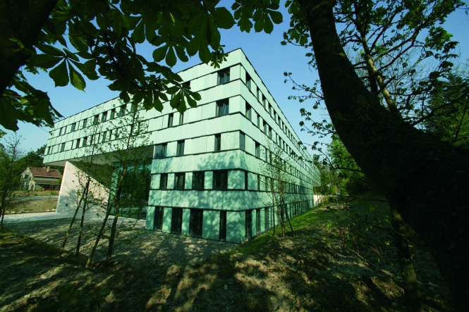
UNAIDS, a suspended building
© UNAIDS
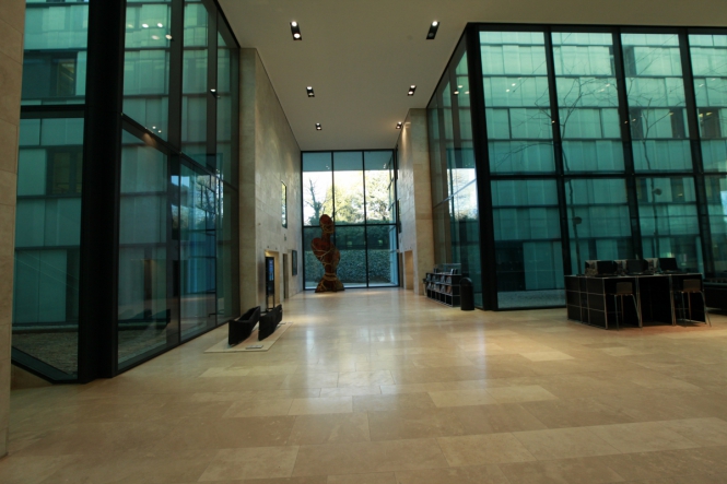
The Green Patios
© UNAIDS
The 50 years since the first WHO building was inaugurated have seen much change. A reconciliation of sorts has occurred and is still occurring between architecture and the society that views and uses it. Influenced by the media, public opinion remains divided as to the value and tastefulness of the spectacular architectural objects presented to its judgment around the world from museums and churches to skyscrapers of all kinds. Several schools of thought have emerged, of which architects are at once promoters and hostages.
In 2001, amid this climate of expanding styles and trends, the Building Foundation for International Organizations invited a select group of architects to participate in an international competition for a building to house the international organization dedicated to fighting HIV/AIDS. The winners, the Austrian architects Carlo Baumschlager and Dieter Eberle, successfully created a structure that holds its own next to Tschumi’s majestic building. They downplayed the mass of their five-storey rectangular structure with several complimentary tricks: a thin, triple-height slab of concrete supporting the overhanging upper floors amplifies the monumental aspect of the entrance; planted areas next to the windows blur the boundaries between interior and exterior; and the partially sliding panels of coloured glass along the façade create playful effects of light and depth. The use of high-quality materials, both inside and out, further enhances the building’s aesthetic appeal. In the “garden of nations” growing to Geneva’s east, the UNAIDS building, inaugurated by Kofi Annan in 2006, plays the role of a butterfly.
*The prize was established in memory of Richard Samuel Reynolds, whose companies helped popularize aluminium as a building material.
(1) Quoted by Franz Graf and Guilia Marino in Le siège de l’OMS à Genève, Etude patrimoniale et recommandations, EPFL, Laboratoire des techniques et de la sauvegarde de l’architecture moderne, February 2015.
(2) S. Giedion, F. Léger and J.-L. Sert, “Neuf points sur la monumentalité” in Architecture et vie collective, Denoël-Gonthier, Paris, 1980 (1956), pp. 40-42. English translation: “Nine Points on Monumentality”.
(3) Federal Council Messages, 21 September 1959 and 17 January 1964: FF.1959, 7916 and 1964, 8924.
(4) Graf, Marino, op. cit.
(5) “Bulletin technique de la Suisse romande”, 19 November 1960.
(6) Graf, Marino, op. cit.
